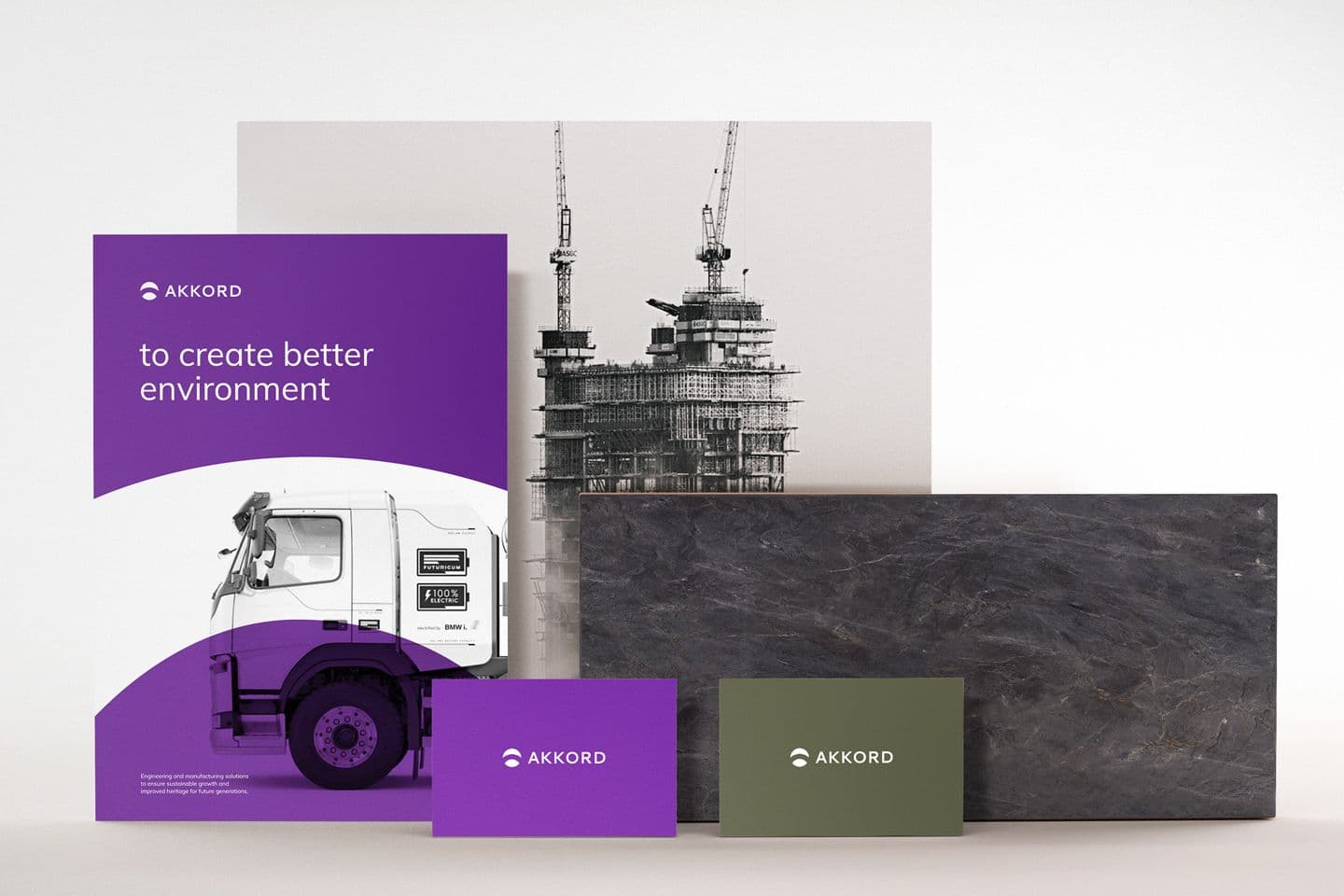
Logotype and Corporate style for Akkord Group
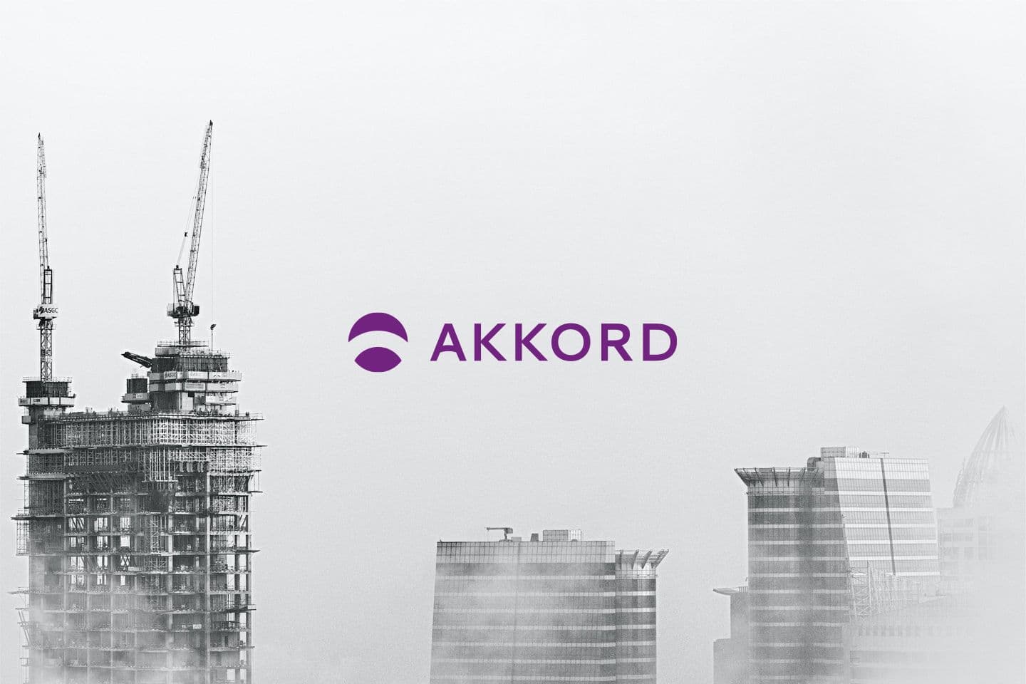
Akkord Corporation is one of the leading companies in the construction sector in the South Caucasus. The company has reached a high level in the construction of residential and non-residential buildings, infrastructure projects, as well as in the production of building materials in a short period of time.
The task was to create a new image reflecting a new stage in the life of the company.
Having researched the brand history, we developed a new logo based on its rich cultural heritage, continuous improvement and innovative views.
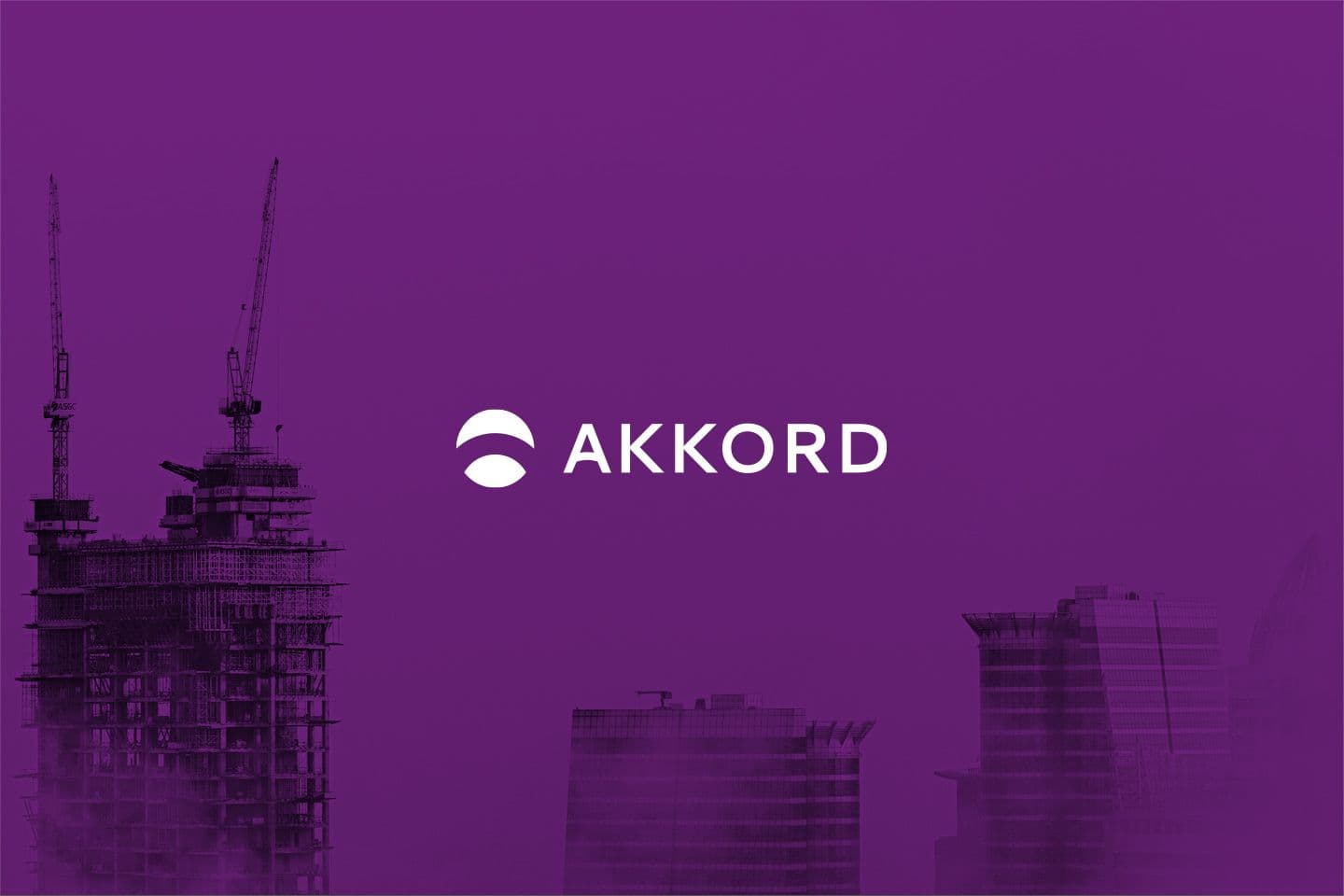
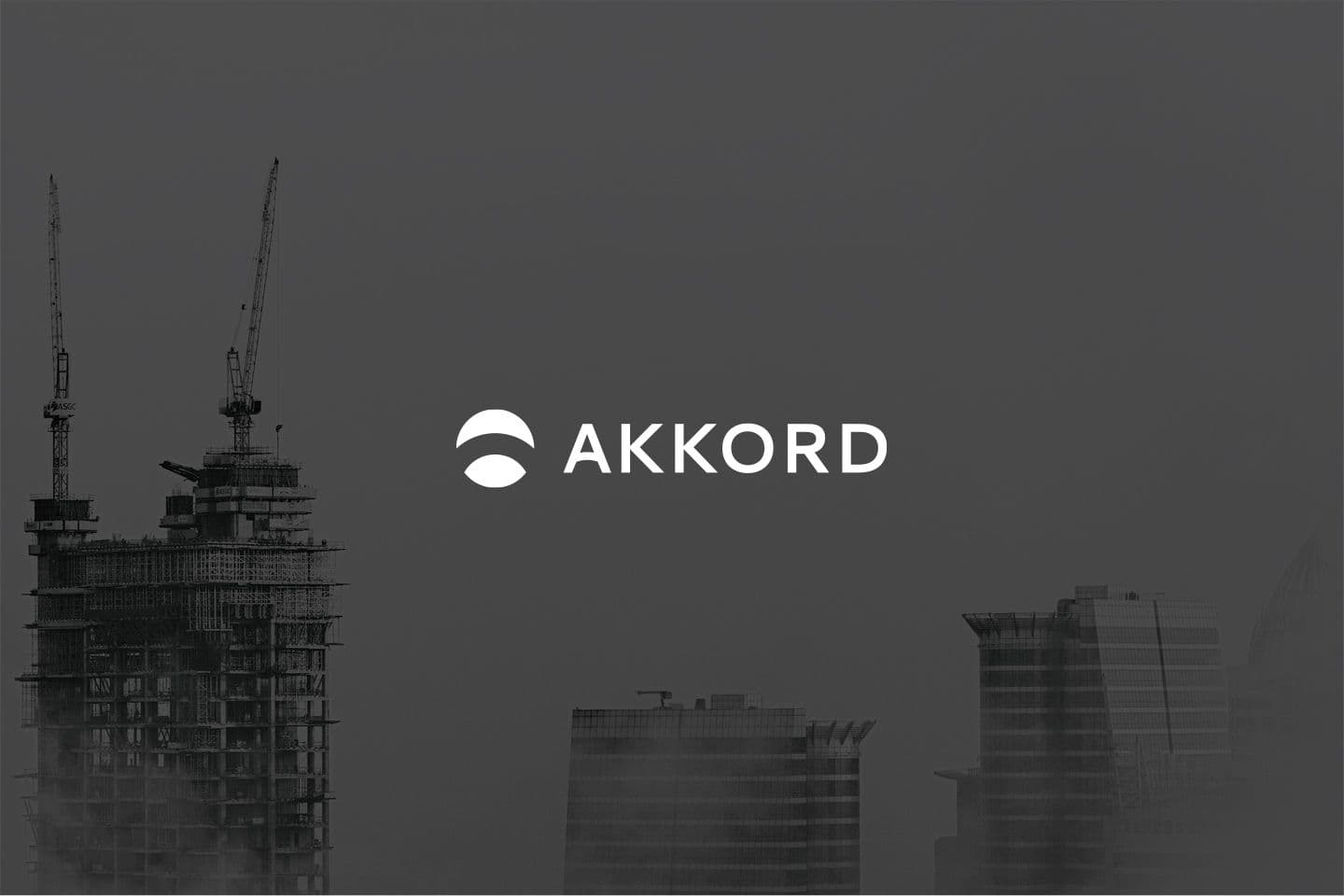
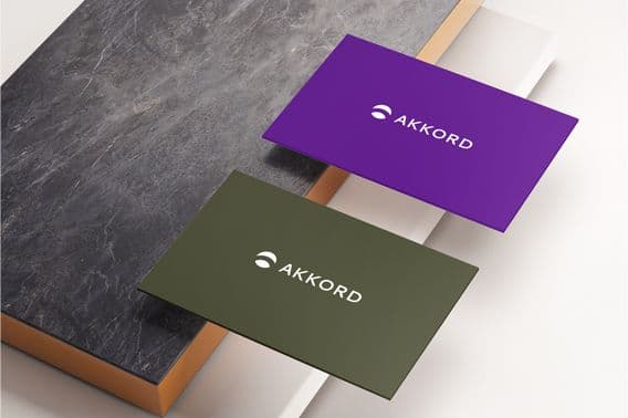
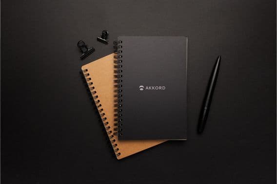
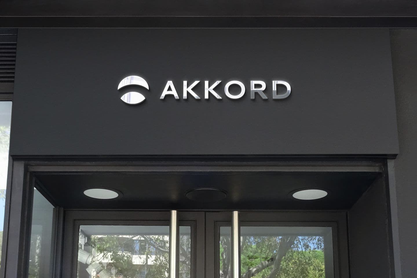
First of all, by separating the symbol from the text, we got two independent elements that can be used together or separately depending on a brand item.
The round shape of the symbol gives the impression of softness. The absence of angles speaks of harmony and mind free of negative thoughts and ideas.
The arc inside the circle symbolizes the stylized letter "A", as well as the horizon line dividing the landscape into two parts: the clear sky and the earth. The horizon is considered a symbol of clarity and foresight.
Purple itself speaks of crazy revolutionary thinking. To give it weight and severety, we used its dark shade. Thus, we received a mixture of maturity and insane youthful energy.

Thank you for your request!
We will contact you as soon as possible.