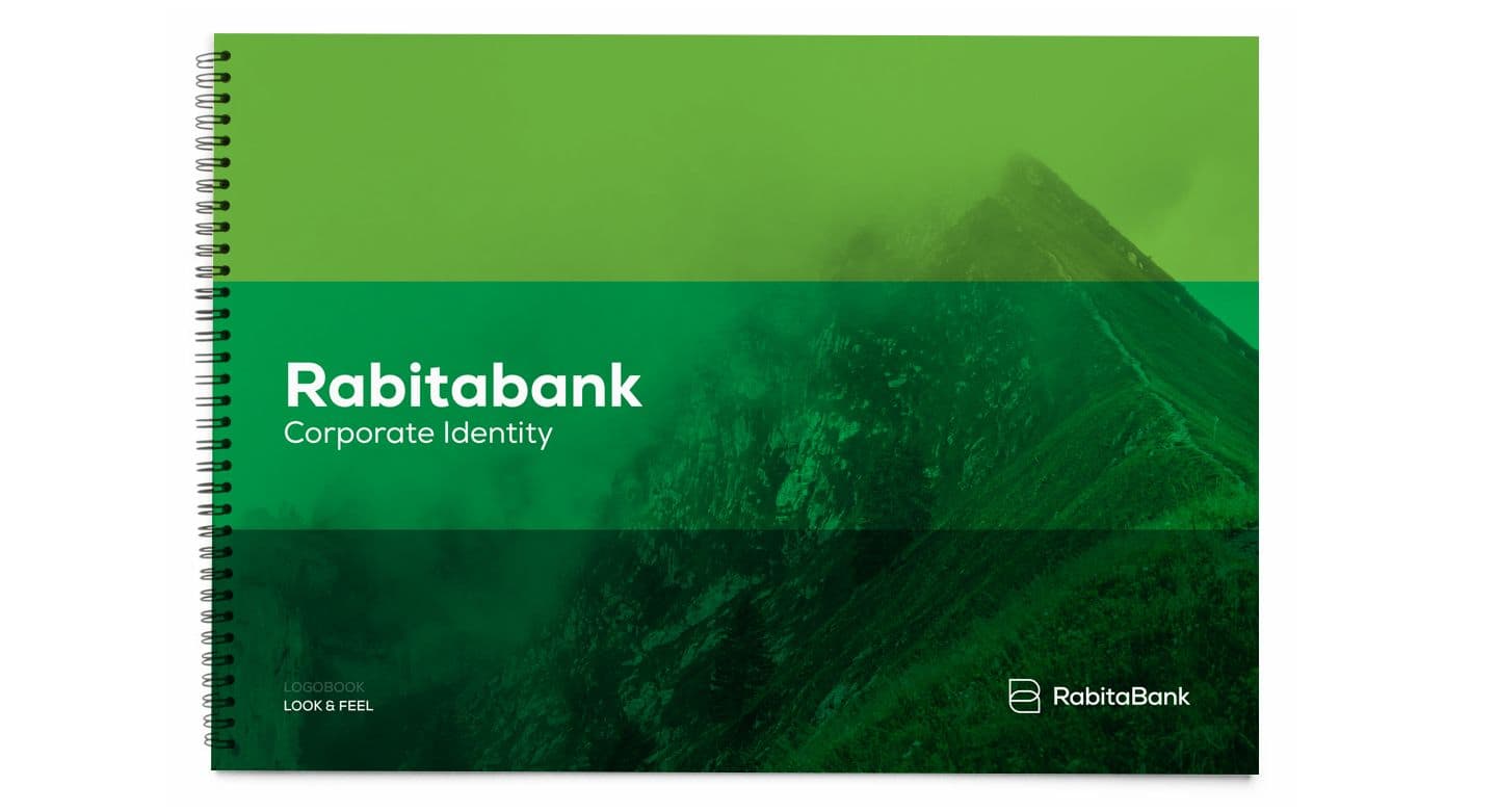
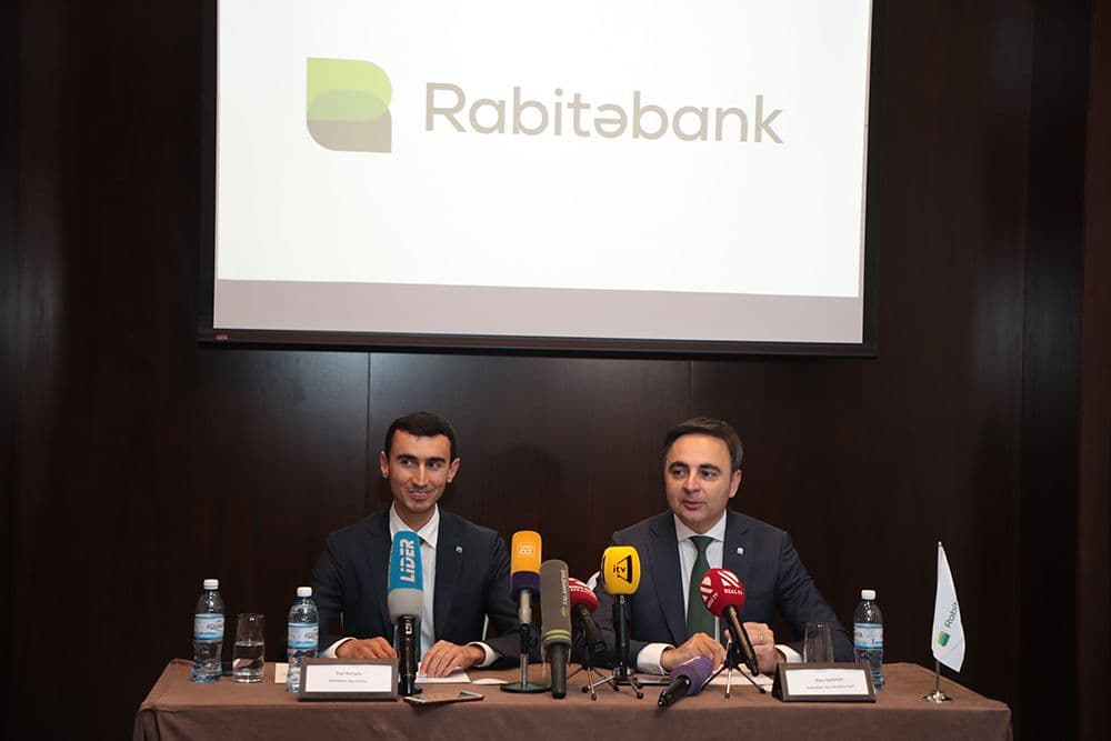
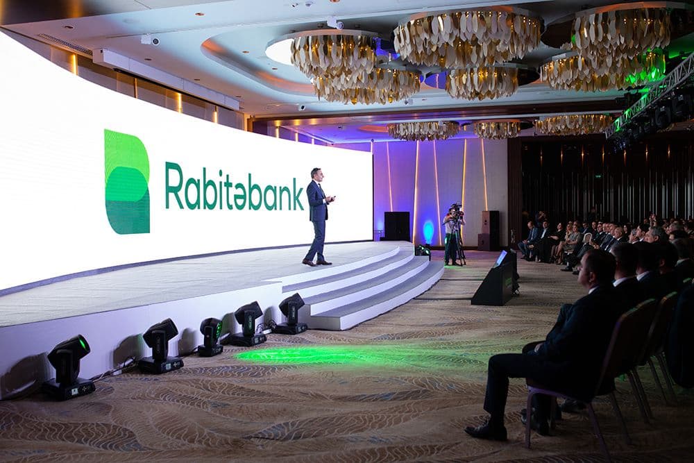
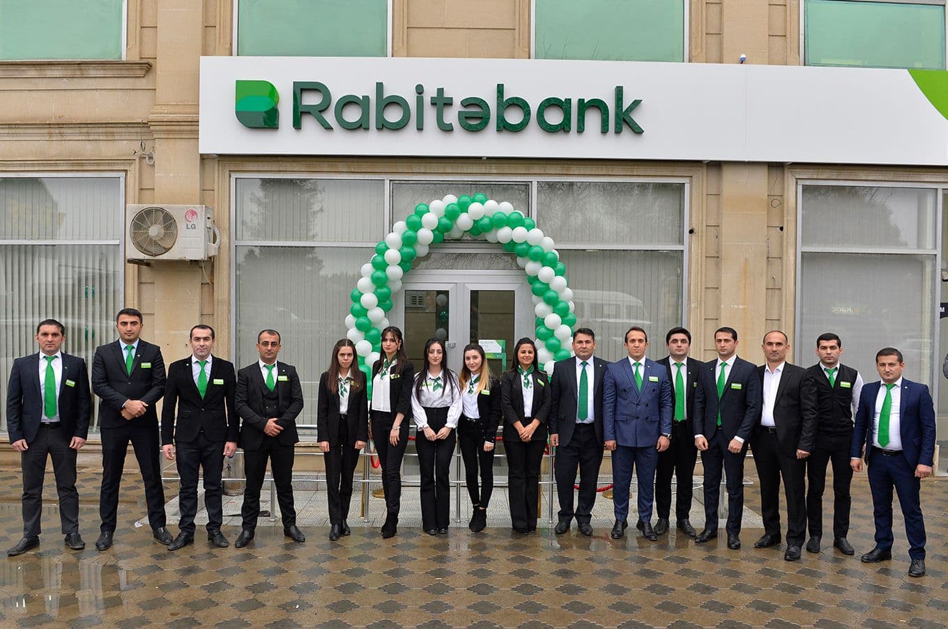
Logotype and Corporate Style for Rabita Bank
Rabita Bank is one of the oldest banks in the country. The task was to develop positioning, logotype and corporate identity.
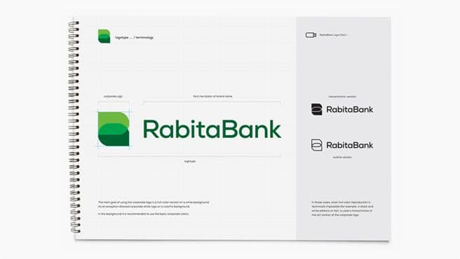
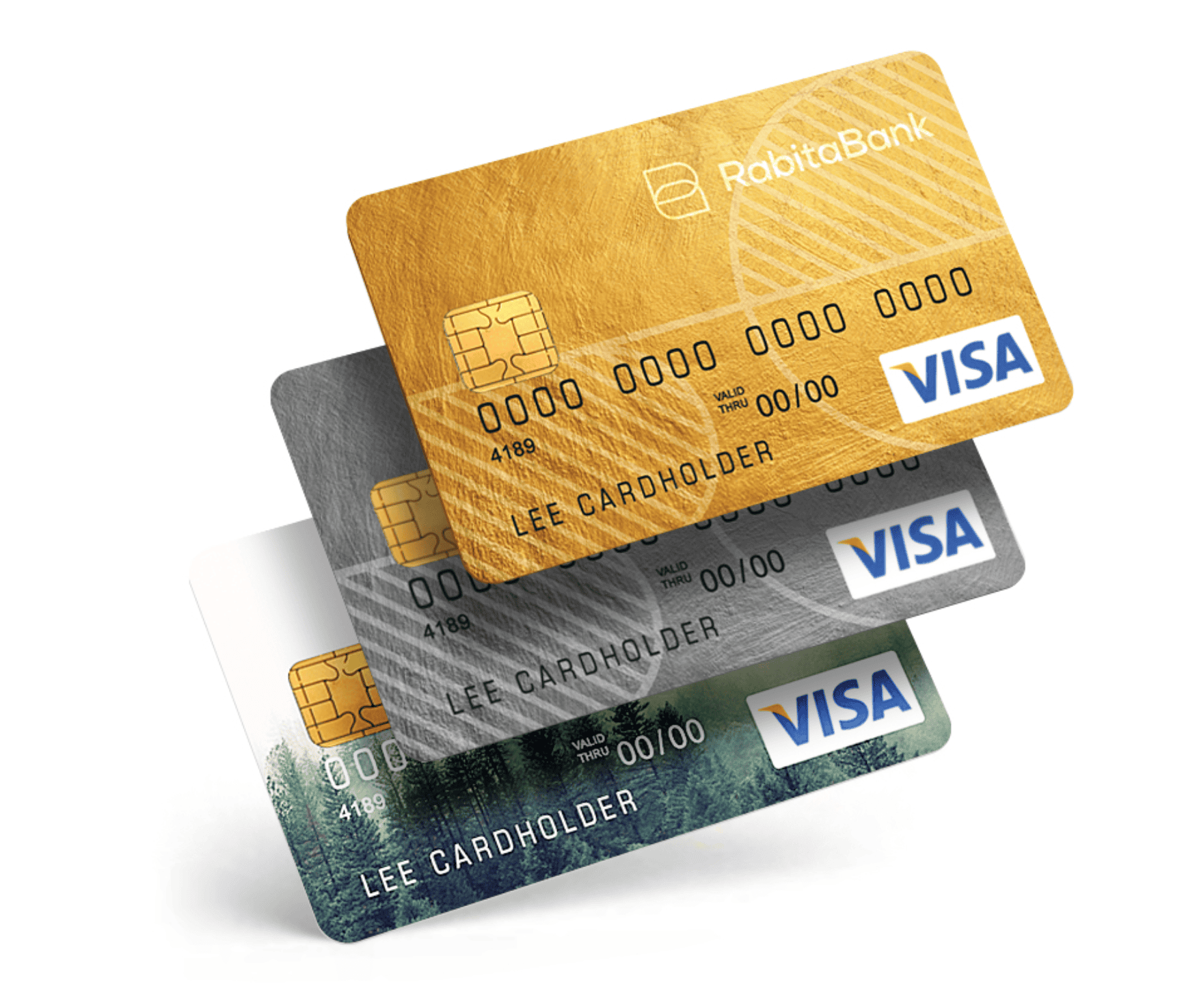
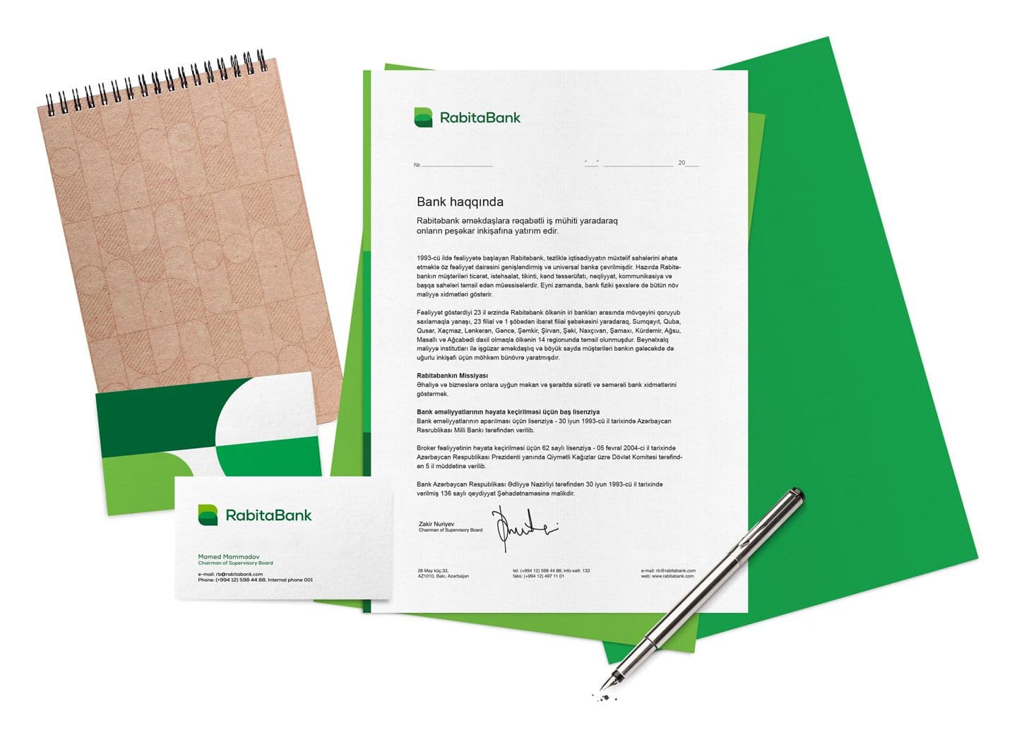
Together with the bank team, we developed a strategy. Based on it, we came up with the character and appearance of the brand. We created a logo, corporate identity and guidelines.
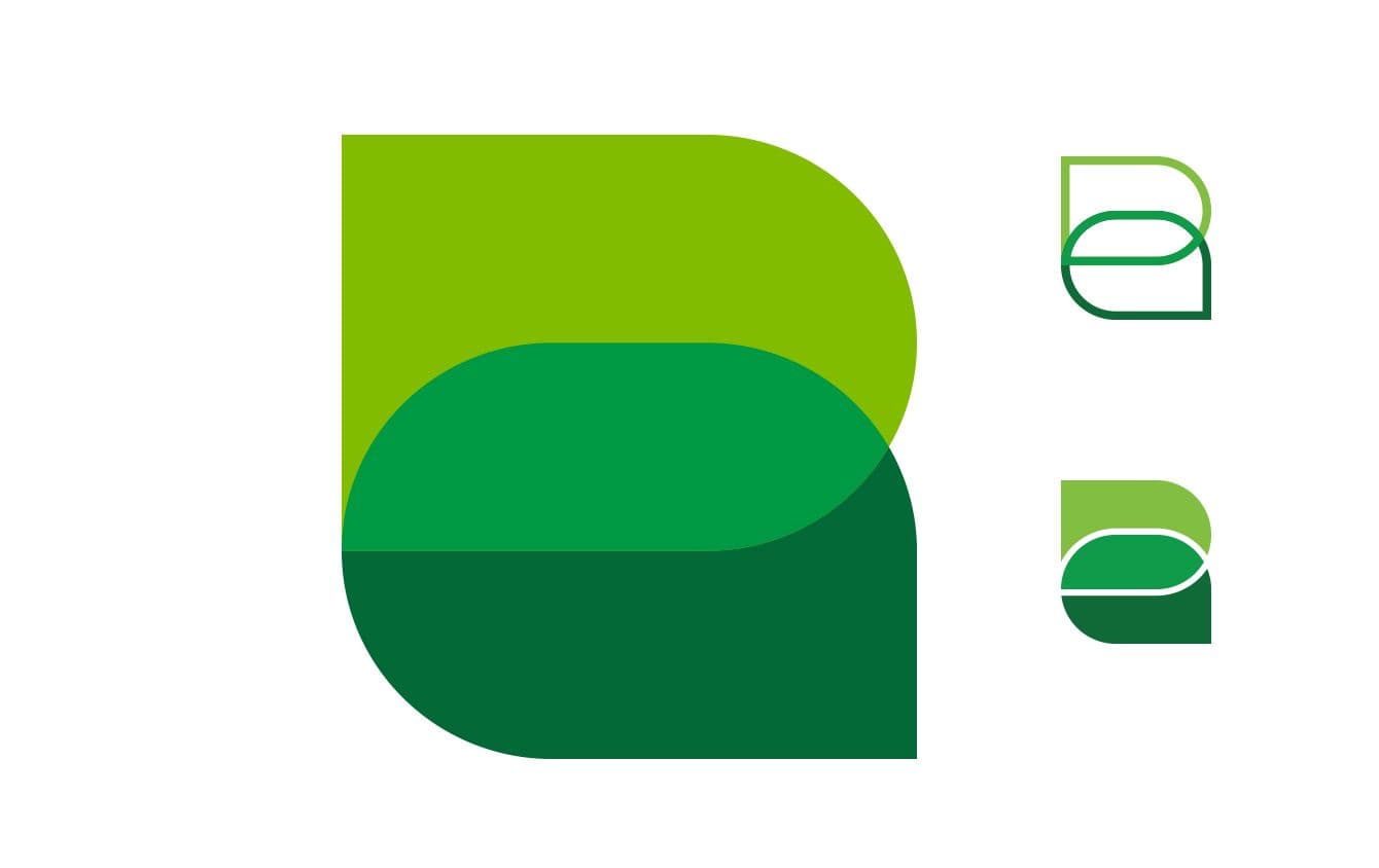
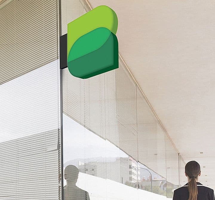
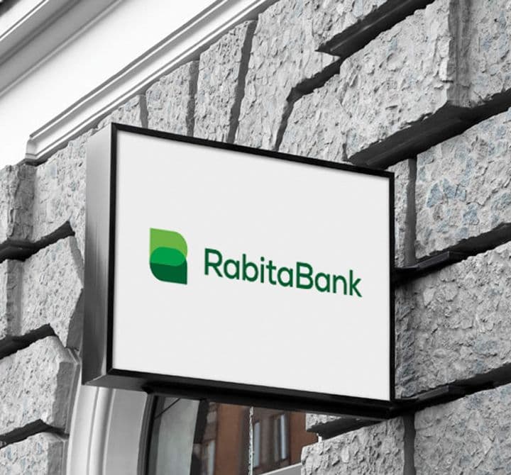
In many languages, Rabita means "connection," "relationship." The colors and shapes of the new logo are combined to create a kind of connection. Forms merging create the letters "R" and "B" at the same time.
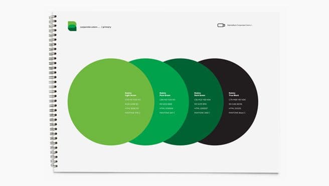
As a result of research, we found that green is free on the market and at the same time it corresponds to a stable and reliable image of the bank. Green stands for development, wisdom, innovation and values.
In conclusion, we've got dynamic and modern identity.


Thank you for your request!
We will contact you as soon as possible.